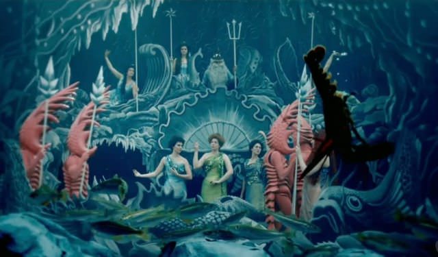
An image from the first ever color film, created by Edward Raymond Turner
The introduction of color film forever changed the movie industry. Black and white film hasn’t been wholly abandoned; it is still a valuable tool for artists who want viewers to focus exclusively on their subjects (In black and white images, the tones, shapes, textures, light play, shadows, and depth of field become more discernible.) But color film has gained a primacy it isn’t going to relinquish any time soon. There’s a very good reason for this. Color gives photographers and videographers a way to manipulate audiences.
That may sound somewhat sinister but it’s not intended to. What it means is that color gives filmmakers a tool by which they can express symbols, foreground certain elements in their compositions, and nudge viewers into feeling one emotion over another.
If you are looking to produce an online video, you should think seriously about the colors you include in it. Certain colors and combinations of colors are able to send subtle messages to audiences – messages that you can use to influence how they receive your video.
As a leading Dallas video production company, GlobalVideoHQ understands acutely that color choices can determine if an online video is a success or a failure. We make color selection an integral part of our Dallas video production process.
The Use of Color in Film
Here are two films that make particularly artful and splendid use of color:
The French fantasist Jean-Pierre Jeunet‘s Amelie is famous for its use of golds and greens. These colors are intended to convey the title character’s bright, outgoing and resolutely un-gloomy disposition.
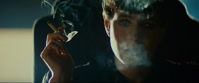
Ridley Scott’s auteurish proclivities often drive him to adopt cohesive color palettes for each of his films. The still both from 1982’s “Blade Runner,” say a lot about Scott limits the range of colors in his films.

The latter film’s cinematographer said, “We used contrast, backlight, smoke, rain and lightning to give the film its personality and moods,” the cameraman says. “The streets were depicted as terribly overcrowded, giving the audience a future time-frame to relate to. We had street scenes just packed with people. . . like ants. So we made them appear like ants — all the same. They were all the same in the sense that they were all part of the flow. It was like going in circles like going nowhere. Photographically, we kept them rather colorless.”
As the quote above demonstrates, moviemakers make deliberate color choices and these choices are based on a great deal of thought. The directors above used the wits and tools of their videographers to restrict the spectrum of colors in their films and heighten those colors that remained. But why, precisely, did they do this? Isaac Botkin, a writer and lecturer on film, explains why color is an important tool and what it can do for those canny enough to use it well. He boils down the art of color to the following: “the use of analogous or complimentary color tones to create contrasts between elements in the frame and communicate emotional ideas to the audience.”
Martin Scorsese, no stranger to stylized visuals, has provided an even more direct and concise explanation of what colors can do. Scorsese says, “Films use light and color to tell a story in a special narrative way, which delivers a strong emotional and intellectual impact on the viewer.”

A still from Scorcese’s “Hugo”
Now, you are likely saying, “I just want to make a training video or a quick promotional video; I don’t have the time or the need for auteurish indulgences and excursions into color theory. I’m not remaking Hugo, after all!”
That’s where you’re wrong.
The Use of Color in Marketing
Filmmakers aren’t the only ones who know how to use colors to influence their audiences. Marketers and the market researchers, who toil in accord with them, have developed quite the appreciation for color. Market researchers have, for instance, determined that people make an initial judgment about a person, environment, or product within 90 seconds of first encountering it, and that between 62 percent and 90 percent of this judgment is driven by color alone. In addition, market researchers have found that nearly 80 percent of what we assimilate through our senses comes from visual stimulation.
There is a reason that Fast Food restaurants generally decorate and package their food using bright hues like red or yellow.

The male Great Frigatebird, like most fast food executives, long ago learned about the virtues of the color red for promotional purposes.
Studies have shown that these videos encourage consumers to eat more hastily than they would do otherwise. This, in turn, prompts them to leave the restaurant more quickly, allowing more diners to sit and satisfy their burger lust.
Market researchers have figured out that, in Western culture, the following colors are correlated with the following emotions and/or qualities.
Red –excitement, sex, passion, danger
Blue — trust, reliability, belonging, coolness
Yellow –warmth, sunshine, cheer, happiness
Orange — playfulness, warmth, vibrant
Green — nature, fresh, cool, growth, abundance
Purple — spirituality, dignity, royalty
Pink — soft, sweetness, security
White –pure, virginal, youthful, mild
Black –sophistication, elegance, mystery
Gold — prestige
Silver — prestige, cold, precision, scientific
Here is a more detailed analysis of what marketers have learned about the meanings that inhere in colors:
Conclusion
Thinking about the feelings and sensations you want your online video to inspire – and then selecting a limited color palette calibrated to do that – is an important, if too often neglected, part of the online video development process. At GlobalVideoHQ, we counsel our clients about color selection, specifically, and more generally advise them on aesthetic considerations, helping them create a video representing their brand and their vision.
[kkstarratings]
 972-318-2811
